3 Tips for better Landscape Photographs
Are you struggling to create stunning landscape photos? Implementing the tips in this workshop you’ll be able to turn your landscapes from boring to stunning in no time.
KEEP IT SIMPLE
Have you ever found a scene with quite a few things that you find attractive and then tried to fit them all into one photo?
Look at this scene. I love five things here: hay bales, a railroad crossing sign, telegraph poles (with wires - usually great for drawing the eye through the image towards the main subject), and a farmhouse in the distance. Unfortunately, there was far too much going on - all at the same time.
The telegraph pole and railroad crossing sign were too close and looked messy - this could work well in front of a bland scene, but not in this photo.
I decided to focus on the flowers and include the farmhouse and telegraph wires as accessories. I cropped this image so that the flowers created a pretty frame at the edge of the photo.
I would always advise spending time with your subjects. Decide on the main subject and where it will be placed in the image.
You can also consider capturing a whole scene and then removing unwanted objects and the foreground by cropping.
This is what I did here.
The original:
After. cropping (and some minor edits):
Most cameras have enough mega-pixels and even the cropped image has enough data to enable good results when printing.
DON’T TILT THE CAMERA
I very often feel the urge to tilt the camera because the foreground - the area between you and the camera and the area where the excitement is happening is far to large.
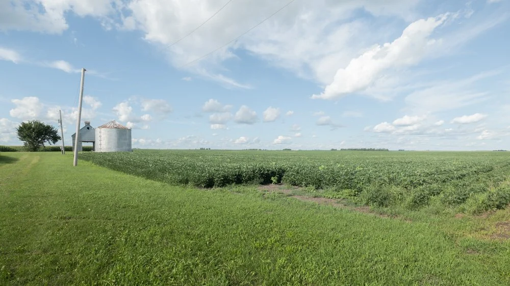
Unfortunately, this often results in warping and distortion. This image shows this perfectly. The sky is the most attractive thing in the photo and when trying to capture it with the lens I had, half of it was missing.
An obvious reaction would be to tilt upwards. But then note the curved horizon and crooked telegraph poles.
In this case it would make more sense to create a vertical image OR use a wide-angle lens and then crop the foreground away.
This image demonstrates how the foreground takes up too much space:
This is the same image after cropping and small edits:
USE THE SETTING SUN TO LIGHT UP THE SCENE
Instead of capturing the sunset take a look around to see what the sun is shining on instead.
Shiny surfaces capture the warmth beautifully:
Colourful scenes become more vibrant:
Muted colours come to life:
I hope you enjoyed the tips in this post. I’d love to know which tips you liked best in the comments below.
We’re also just discussing landscape photography in the Girls with Cameras Community - it’s a free community for female photographers around the globe. Would you like to join?


